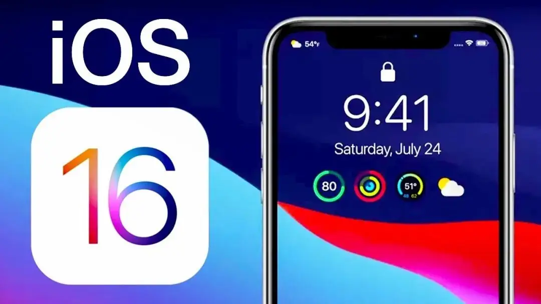
To accompany the new lock screen widgets, Apple has also redesigned the notification system in iOS 16. Starting this year, notifications now appear at the bottom of the lock screen instead of the top below the clock. This change has proven controversial for many iPhone users, but there are a few settings you can tweak to improve your experience…
iOS 16 notification changes
Apple says the new bottom-up design for iOS 16 notifications is aimed at reducing clutter on the lock screen. The idea is that by moving notifications to the bottom, you can see more of the wallpaper. This is especially important with iOS 16, which adds a host of new lock screen personalization options such as widgets, depth effect wallpapers, live wallpapers, and more.
This means that when you update your iPhone to iOS 16, your notifications will automatically start appearing at the bottom of the lock screen. You can swipe up on these notifications to see more notifications and easily delete them, tap them, and manage notifications for each app.
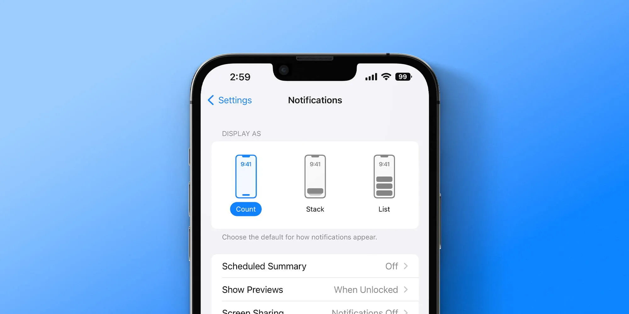
But along with these changes, Apple has also added some new customization options for iOS 16 notifications. If you head to the Settings app and tap on Notifications, you’ll see three different options. Each of these options is used to customize the appearance of notifications at the bottom of the lock screen.
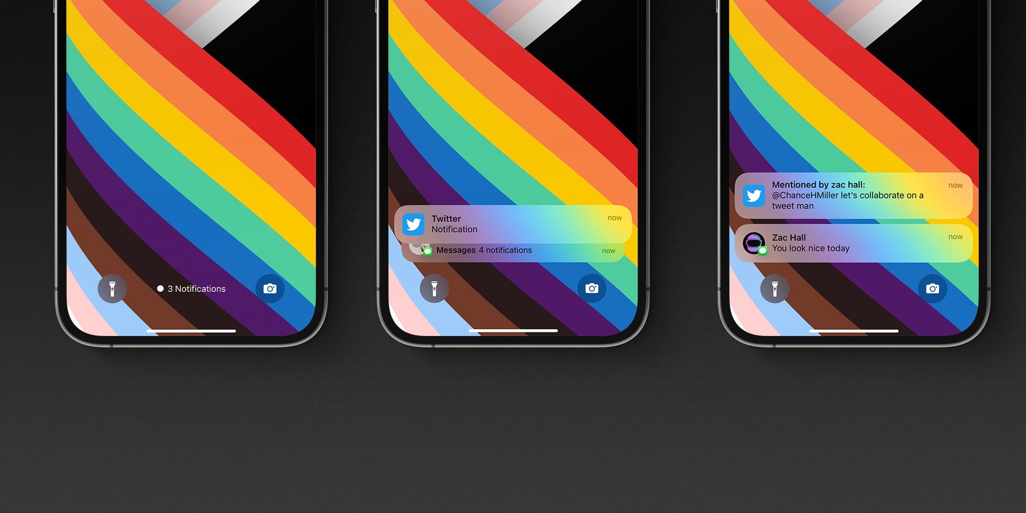
- Count: This replaces notifications on the Lock Screen with a simple piece of text that tells you how many unread notifications you have. You can swipe up to view a full list of your notifications.
- Stack: This option takes all of the notifications from each individual app and “stacks” them up. So you have individual groups of notifications for each app on your Lock Screen and in the Notification Center.
- List: This is the traditional iOS system for notifications from previous years. You’ll simply see a list of all your notifications that you can expand by swiping up from the bottom of the Lock Screen.
You can also temporarily enable “Count” at any time by simply dragging down on the notification on the lock screen; this will minimize and display only the number of notifications.
Unfortunately, what you can’t change is the location of the notification. There is no option to revert to the “classic” notification design in iOS 16. That makes sense given the new widgets on the lock screen, but based on early sentiment on social media, it seems certain there will be a market for a “classic” lock screen option.
There is also a change in iOS 16.2 specifically for iPhone 14 Pro and iPhone 14 Pro Max users. In iOS 16.2, you’ll be able to suppress notifications from appearing on the always-on display, a change that may help ease some users’ concerns about the redesign.
What do you think of these new designs for iOS 16 lock screen notifications? Have you gotten used to the new bottom-up design, or do you wish there was a way to recover? Let us know in the comments.
Read more articles: RedTomElectronics
If you have more ideas to discuss with us, welcome to join our Apple Fans Club on Facebook.
