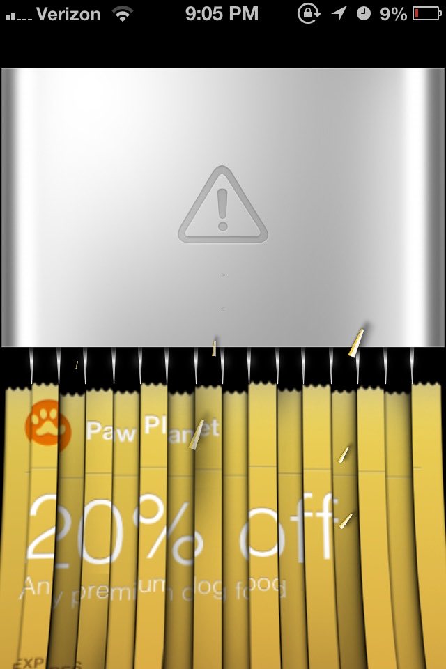
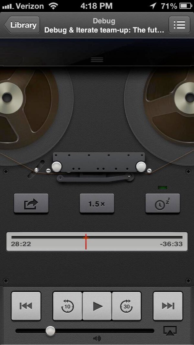
I’ve gotten way too attached to skeuomorphic design language over the years. The attention to detail was just mind-blowing!! iOS 7 gave me such whiplash stripping all of the lifelike elements out so suddenly.
Riku Wallin
That’s back when they understood what usability was, and interfaces were made to be fast, practical and intuitive to use. The flat UI trend is nothing but hostile inaccessible anti-design with no identity, and its “usability” relies on accident and serendipitous discovery.
Janko Lauterbach
I always prefer the more detailed UIs because it pleases my eyes so much more. The design nowadays is often more functional and raw, but nowadays it often feels stripped. I think it could look nicer today without being too skeuomorphic.

