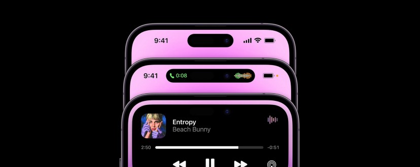
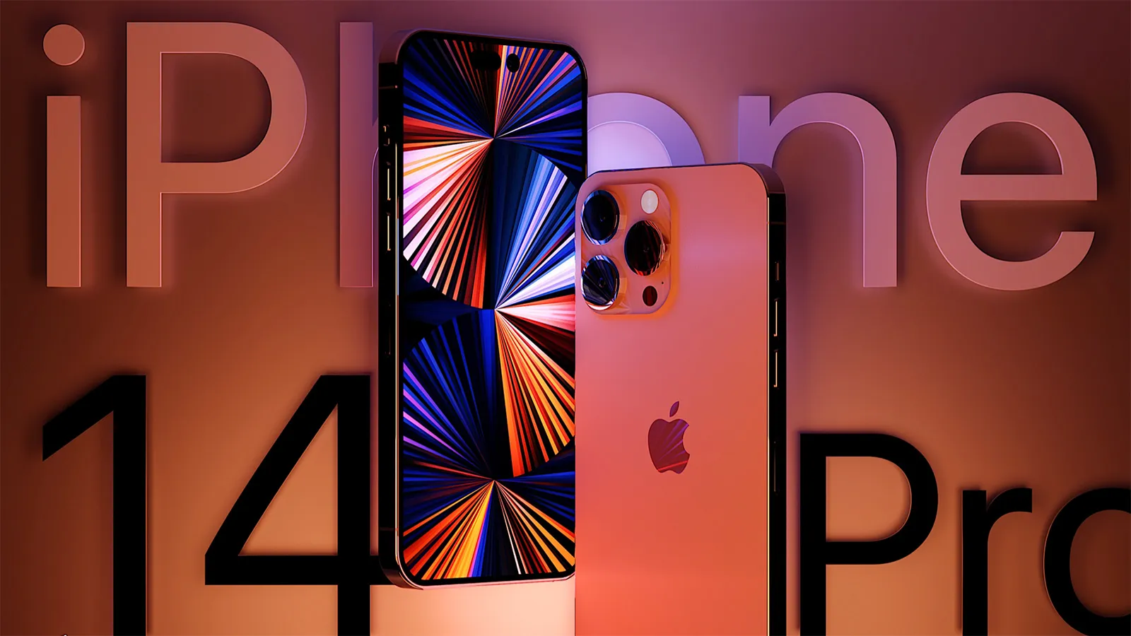
Apple just announced its newest devices during its September “Far out” event. The line-up includes new Apple Watches, AirPods, and iPhone. But the iPhone 14 Pro and Pro Max is the device you need to keep an eye out for. It features a new TrueDepth camera system, removing the infamous notch and replacing it with a pill-shaped cutout.
While plenty of people have been mocking Apple for keeping the notch instead of searching for an alternative like an under-display camera similar to competitors. But the notch has always been a unique feature, making the iPhone stand-out from other smartphones, which all have become flat touch screen bricks. With the new Dynamic Island, they ensure iPhone still has a recognizable front display while introducing useful functionality. It’s a seamless integration of hardware and software that can show activities like playing music, timers, … and updates such as charging, AirPods connection, calls, …
Let’s take a look at how you can take advantage of the Dynamic Island for your own apps.
How iPhone uses Dynamic Island
Apple shows relevant information when closing an app or when you have an incoming notification or an alert is displayed. You can tap and hold the Dynamic Island, and it expands to show more information, or simply tap to go back to the app.
Here are some built in examples of how iPhone takes advantage of Dynamic Island.
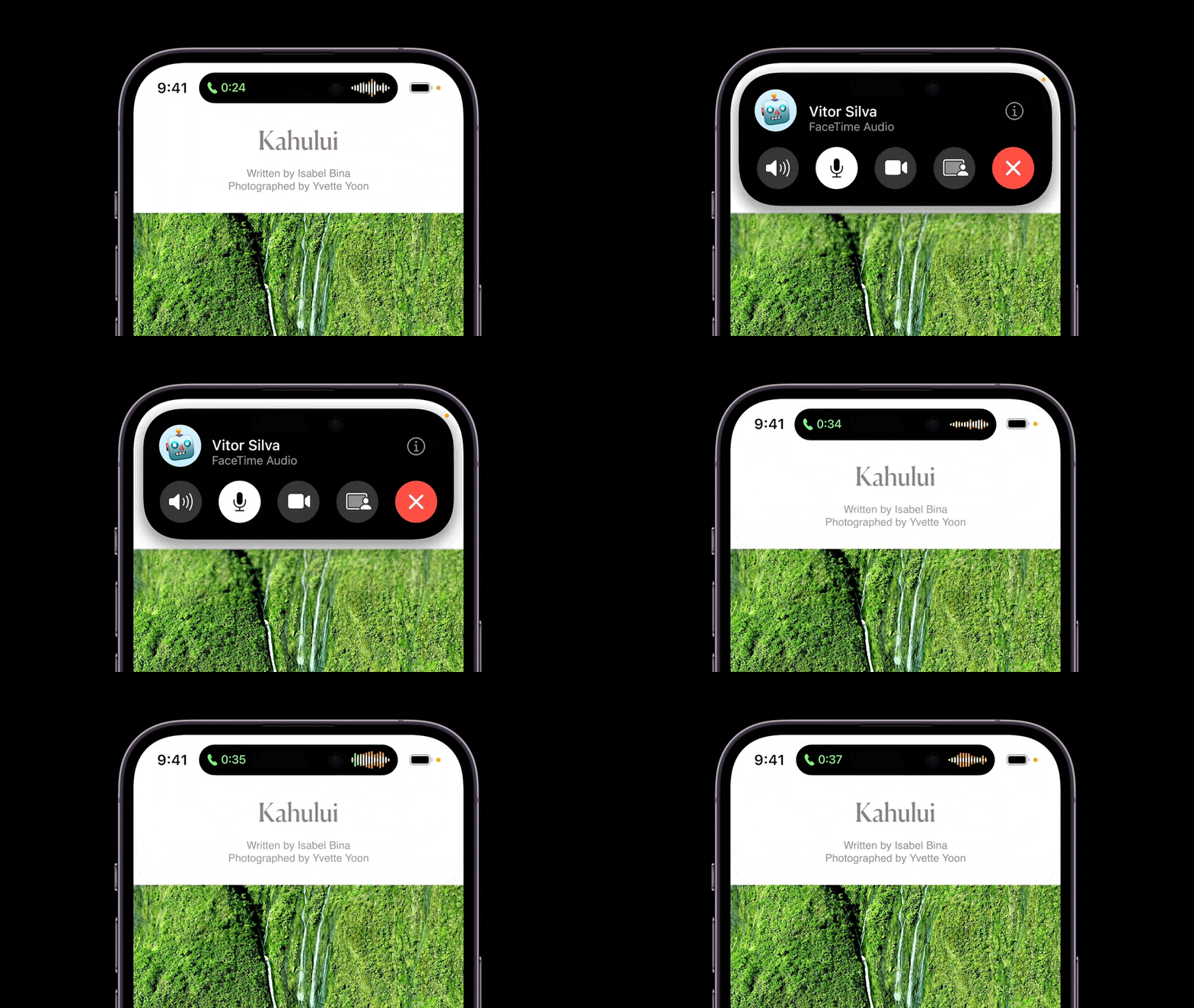
Phone calls
The island transforms when you have an incoming phone call and shows a sound and timer indication while you have a phone call in the background.
Music
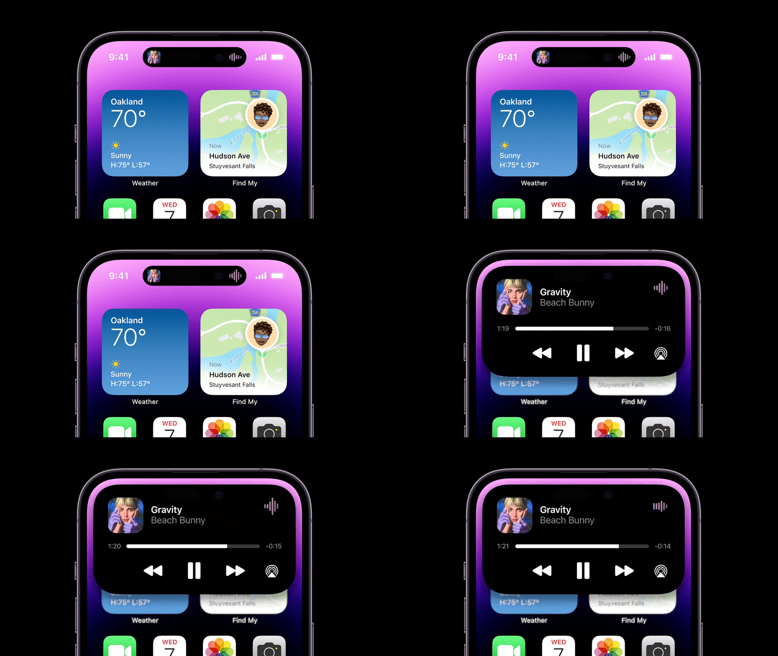
When you close the Music app and have a song playing, the album art will be displayed with an animated sound graph. This will likely work for any music or sound app, similar to how it’s displayed on your lock screen and control center.
Connecting AirPods
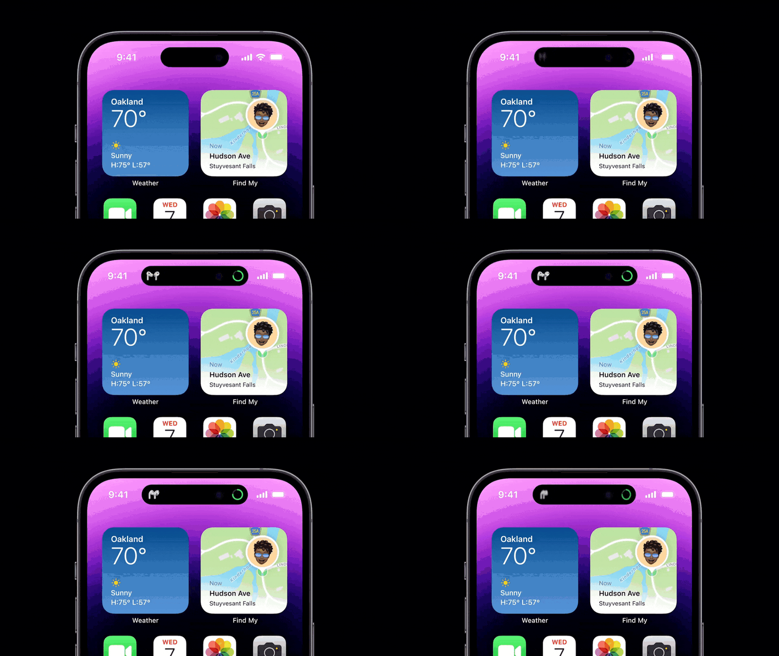
Once your AirPods are connected, a visual of your AirPods model is displayed together with the current battery status.
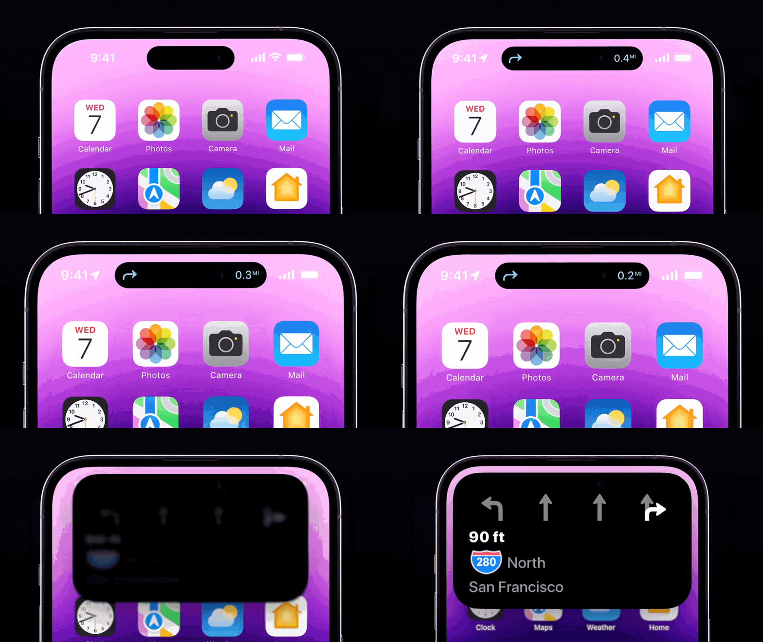
Navigation
Turn by turn navigation is displayed with directions and distance. When you have to switch lanes or take an exit, the Dynamic Island expands and shows you more information.
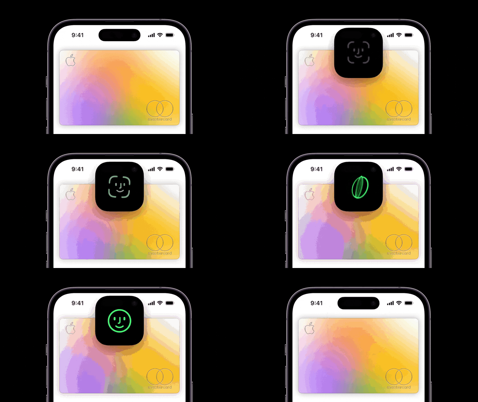
Face ID
Previously, the Face ID authentication would be displayed at the center of your screen. Now it integrates into the Dynamic island as it expands when you have to authenticate.
Muting your iPhone
When switch the mute toggle, a short status is shown.

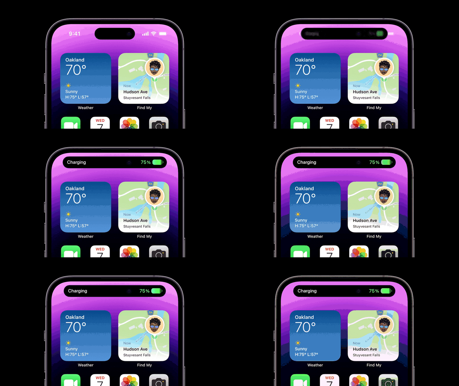
Charging
When you start charging your device, the Dynamic Island informs you about it and show your current battery percentage.
More examples
Voice Memos
While you are recording a voice memo, a sound graph and timer similar to a phone call will be displayed.
Focus modes
When your focus mode changes, it will be briefly displayed to inform you it has been activated.
Timers
When you activate a timer, you can see the time left with a quick glance without having to touch your iPhone.
These are just a few examples that Apple showed during the keynote.
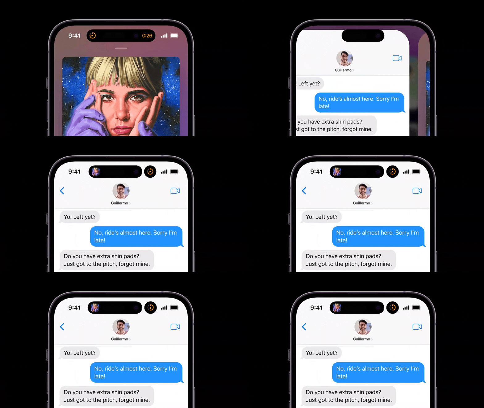
Multiple Activities
It’s also possible to see two activities at once, for example, while having an active time and playing music. The Dynamic Island will automatically adapt to show you more information.
Always on display
Thanks to the always-on display on the iPhone 14 Pro and Pro Max, you will be able to see the Dynamic Island on your lock screen, so any relevant information will always be visible when you glance at your screen.
When the screen is dimmed and your device is locked, a lock icon will be displayed to inform you that no one can access your device if you leave it on your desk or table.

How to use Dynamic Island in your own app
Activities in Dynamic Island are built similar to Live Activities introduced with iOS 16. These or glanceable time-based alerts that are displayed on your iPhone’s lock screen. They update live when a sports teams scores, your coffee order is ready or when your Lyft ride is nearby.
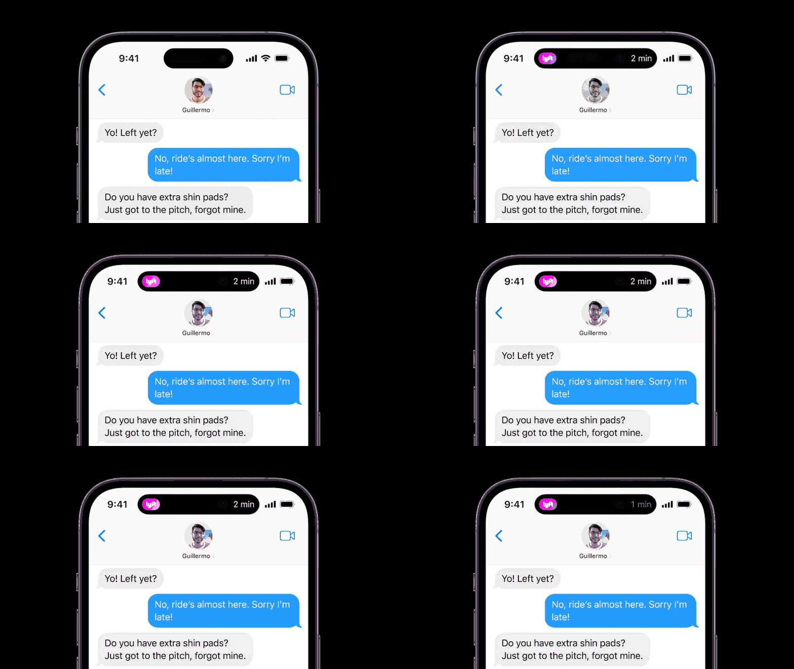
Of course, there is a lot less space on the Dynamic Island compared to Live Activities. So, you have to make sure you show the most relevant information. The user can then expand it by tapping and holding on the Dynamic Island to view more information.
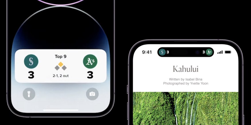
Apple built a design system that you can use for your own app to ensure everything displayed in the Dynamic Island is consistent for every app.
Permissions
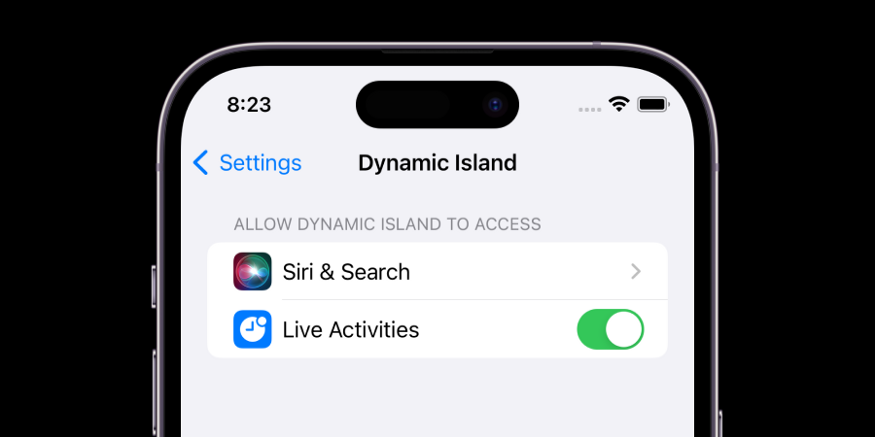
With this new UI, you might think all hell is going to break loose as it will be constantly animating and updating throughout the day. But Apple will likely add a toggle in Settings to turn it off per-app, as they previewed for Live Activities coming in a later iOS 16 release.
Adapting your designs
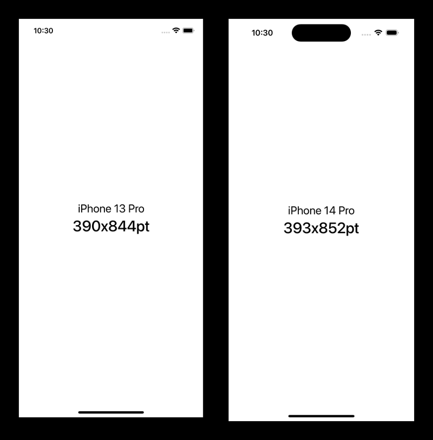
You currently might design for devices with a notch, where the status bar height varies for different iPhone models. This is also true for the new iPhone 14 Pro models where the status bar height is now 54pt.
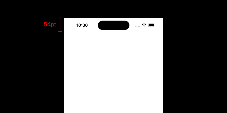
Here’s the height for other iPhones:
- 44pt (iPhone X, Xs, Xs Max, 11 Pro, 11 Pro Max)
- 47pt (iPhone 12, 12 Pro, 12 Pro Max, 13, 13 Pro, 13 Pro Max, 14, 14 Plus)
- 48pt (iPhone 11, Xr)
- 50pt (iPhone 12 Mini, 13 Mini)
- 54pt (iPhone 14 Pro, 14 Pro Max)
The iPhone 14 Pro screen size (393x852pt) is also a tiny bit larger than the iPhone 13 Pro (390x844pt).
How to design a live activity for Dynamic Island?
A Dynamic Island Live Activity has 3 different ways to be displayed:
- As a single activity using a leading and trailing compact view
- As a minimal view, attached to the TrueDepth camera or detached from it. Those views will be visible when 2 activities are active at once, the system will decide where your activity will be displayed and if it will be visible.
- Expanded view after a long press
You are required to support both compact views and the minimal view to make sure your Live Activity can be displayed on the Dynamic island.
Expanded view
It’s also required to support the expanded view, which will be displayed after a long tap. It will also appear briefly when your Live Activity updates. An interesting addition, devices without the Dynamic Island will also show the expanded view as a banner when the activity updates.
The Dynamic Island is split up in different regions where you can place your UI elements.
- Center: below the camera
- Leading: An L shape on the leading position next to and underneath the camera
- Trailing: A mirrored L shape on the trailing position next to and underneath the camera
- Bottom: Space below the leading and trailing areas
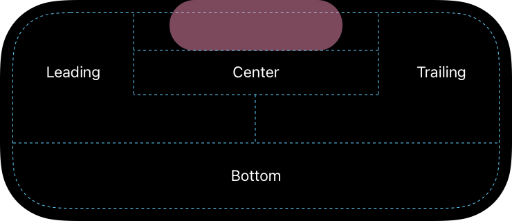
The system will first calculate the with of center content while taking the minimum with of the leading and trailing region into account. After that, the leading and trailing content will be placed and sized based on the vertical position. But by default, leading and trailing regions will have the same width.
However, you can set the priority, so the system knows which region should be prioritized. That view will get priority and will be able to use the full width of the Dynamic Island.
Read more articles: https://www.facebook.com/RedTomElectronics/
If you have more ideas to discuss with us, welcome to join our Apple Fans Club on Facebook.

