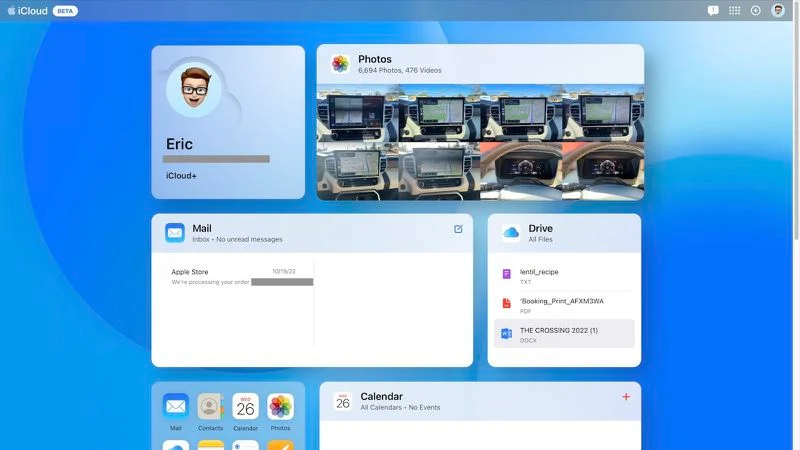
Apple today introduced a new design for the iCloud.com website, available as a beta version on Apple’s testing site beta.icloud.com.
The updated design differs significantly from the current iCloud design, displaying a full tile on a customizable homepage along with previews for Photos, Mail, iCloud Drive, Notes, and more.

You can choose the apps most commonly used on the iCloud home page, choosing from all of the apps listed above, as well as apps including Pages, Numbers, Keynote, and Calendar.
Apple has slightly redesigned some apps, tweaking the toolbar and button positions for a smoother experience.
Anyone can check out the new “iCloud” interface by visiting the beta site. It will be in testing for a while, and the new look will likely expand to the main iCloud website after Apple addresses any bugs in the design.
Read more articles: https://www.facebook.com/RedTomElectronics/
If you have more ideas to discuss with us, welcome to join our Apple Fans Club on Facebook.


