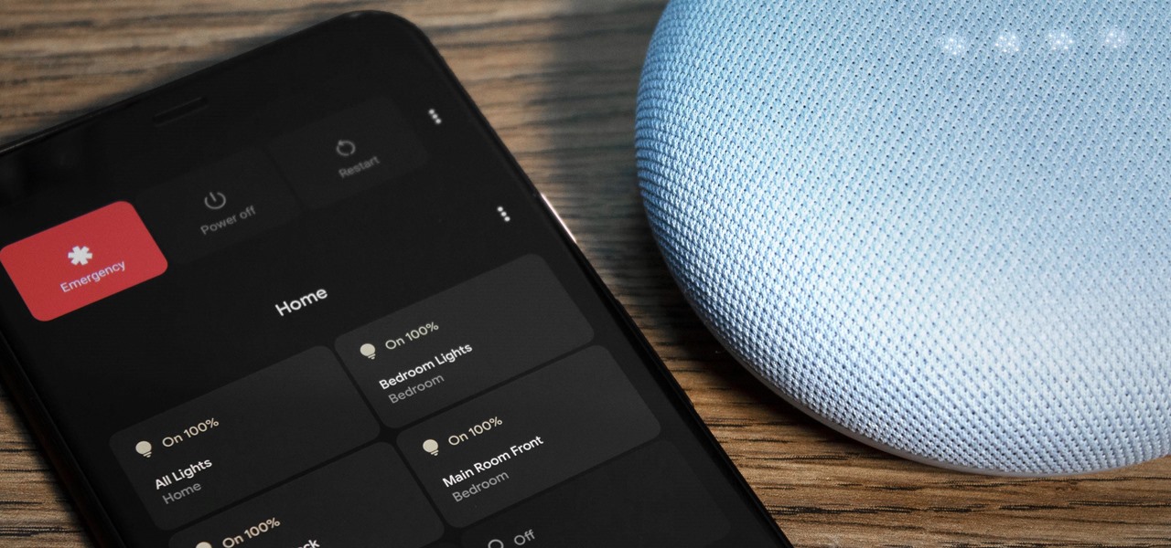
If you’ve used Android 12, there’s a good chance you’ve noticed the stripped-down power menu, Google has neutered many of the features after building them up in Android 11. And the company apparently knows it. As Android Police reports, Google has quietly added a notification explaining where all those missing features went.

Open the power menu for the first time and Android 12 will pop up a (rather dim) notification telling you to swipe down from the top of the screen to find Google Pay, Home controls and other lost features. It’s not nearly as convenient as before, but at least, you won’t be scrambling to locate common tasks.
The alert suggests that some Google staff aren’t entirely happy with the Android 12 power menu change. There’s some evidence to support that dissatisfaction as well. One Googler commenting on a bug tracker for the power menu claimed that the product was doomed if the reduced feature set was a deliberate decision.

While that statement is clearly hyperbolic, it does raise hope (however slim) that Google might reverse course if enough people are unhappy about the power menu regression. If nothing else, it’s a reminder that companies don’t always have uniform support when they implement OS feature changes, and those changes aren’t necessarily set in stone.


