As we all know, guys, the Apple has made the remarkable work with its Weather app in adding Dark Sky data, yet still keeping the app simple and clear to use, in iOS 15.
Here is how good the new Weather app in iOS 15 is — you’re not going to miss Dark Sky. It’s still a shame that Dark Sky has gone, has been removed from Android, and countless other apps can no longer use its data, but Apple’s new Weather app is great.
It’s not as if the Weather app has ever been bad. Apple’s stock app has always told you the basics of what’s going on around you, or anywhere you nominate, and that was fine.
Apple’s Weather app was never poor, and it never looked bad, it was just basic. It was basic enough that millions of people used it, but also basic enough that it spawned an entire class of third-party apps.
Arguably the best of those was Dark Sky, and it was known for the accuracy of its weather data. While it didn’t work as perfectly outside the US, within the States, it could tell you that rain was starting in 7 minutes and stopping in 21, and it would be right.
Now that feature has come to the stock Weather app, at least for the US. Certain elements, such as air quality maps, are said to be coming to further regions. However, we’ll only really know the accuracy of rainfall when iOS 15 officially ships and is on millions of devices.
What those millions of users will get, though, is an app that is almost always very easy to use. And if it takes a little getting used to, also almost always shows you exactly what you want to know.
What you would get in the new Weather app
You can learn more about how Weather has changed by following one of its Apple engineers, who calls herself Novall Swift, on Twitter. If you just want to use the app, though, then the first time you pick it up, you notice several things.
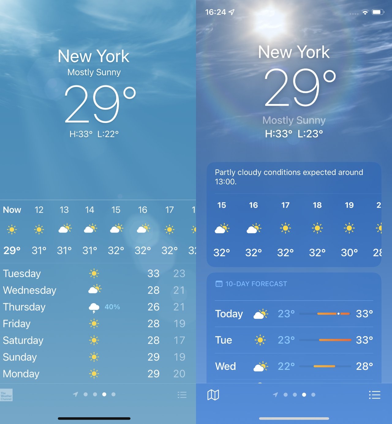
First, it looks remarkably similar to how it did under iOS 14. Then you spot the new animations, depending on what the weather conditions are like when you look.
When you aren’t just looking, you need the information, that’s when you see that everything has subtly changed. The hourly forecast for today is spaced out wider, meaning you see around two fewer hours on an iPhone 12 Pro screen, but each hour is much clearer.
Similarly, the long-range forecast also gives a bit more room for each day, though at present it’s all headed “10-day Forecast” and shows only 9.
Again, too, you do lose immediate access to some data. On an iPhone 12 Pro screen, the iOS 14 Weather app shows you the hourly forecast, then takes you to 7 days in view.
On an iPhone 11 Pro with iOS 15, the first glance usually shows the hourly forecast plus as few as 3 days.
Getting still more information
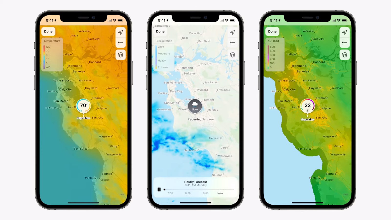
While all of the elements of the old Weather app are in the new one, there are more. So for instance, if you scroll down from today’s summary details, you’re presented with a map.
It’s a close-up map of your region and while the area remains the same, the detail does not. You can see a temperature map, a precipitation one, and an air quality one as well.
Pinch in and out to see as big or small an area as you like, and the map will then show a moving projection of how the temperature or rainfall is expected to change over the next hours.
Slight confusions
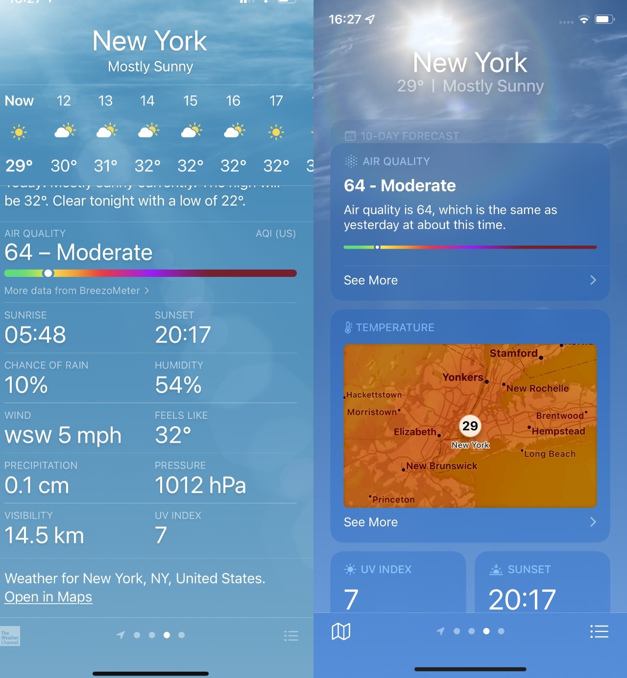
Just a little confusingly, there are two different ways to get this map information. You can simply tap on the thumbnail that gets shown to you anyway, or you can press on a button at bottom left of the screen.
That’s the point where Apple used to display an icon and link for the Weather channel.
There’s also an issue of how you get to set up different locations. By default, the Weather app shows you your current location, but you can add any city in the world. If you’ve ever done that before, the new version picks up your previous selections.
To add a new location for the first time, you start by pressing an icon of three horizontal lines, positioned at bottom right. This is the same icon as for the iOS 14 version, but again, it’s larger and clearer.
The new app also makes the search feature much more prominent. Instead of looking for the magnifying glass icon to start a search, the Weather app figures you wouldn’t be in this section if you didn’t want to add a new city.
Changeable weather
You would notice that we say it usually shows something, or it typically shows something. In practice, while all of the information is always there, the order will change.
The new weather app surfaces the information you are most likely to need. So for instance when it’s raining, or about to rain, you’ll get a banner toward the top telling you about about getting precipitation notifications.
Those are the new Weather app’s equivalent of Dark Sky’s updates, so once you’ve set them up, you just automatically get notified of impending rain.

