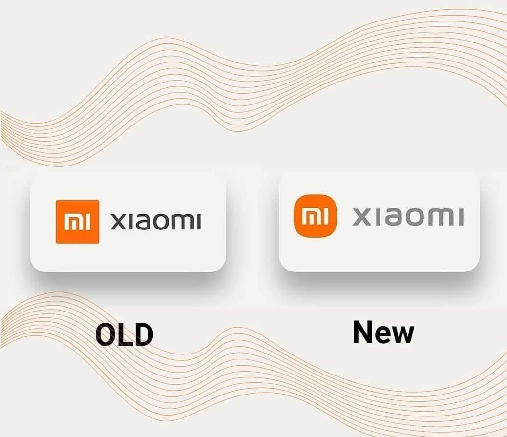
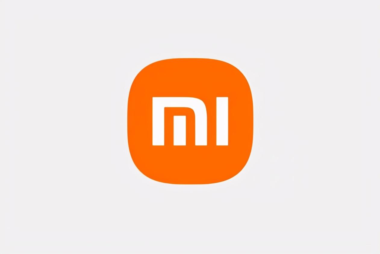
Recently, the issue of Xiaomi’s new Logo has become one of the hot topics discussed by netizens. Lei Jun announced at the spring new product launch event that Xiaomi will adopt a new logo, designed by Japanese designer Kenya Hara, which costs 200 million CNY in 3 years. But when the new logo was unveiled, netizens were stunned. You can’t say that it is very similar to the original one, you can only say that it is exactly the same.
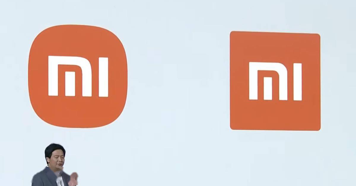
After that, many people went to Lei Jun’s Microblog to comment that Mr. Lei, you were cheated. Indeed, Xiaomi’s new Logo has only changed from the original square corners to rounded corners, and the internal Mi has not even changed. However, Lei Jun also said at the press conference that it is not just a simple and morphological change, but an internal and spiritual upgrade.
Now I know that these two million CNY are too good to make. Don’t need to give me two million, give me two hundred dollars and I can help other mobile phone brands design their new logos. LOL.
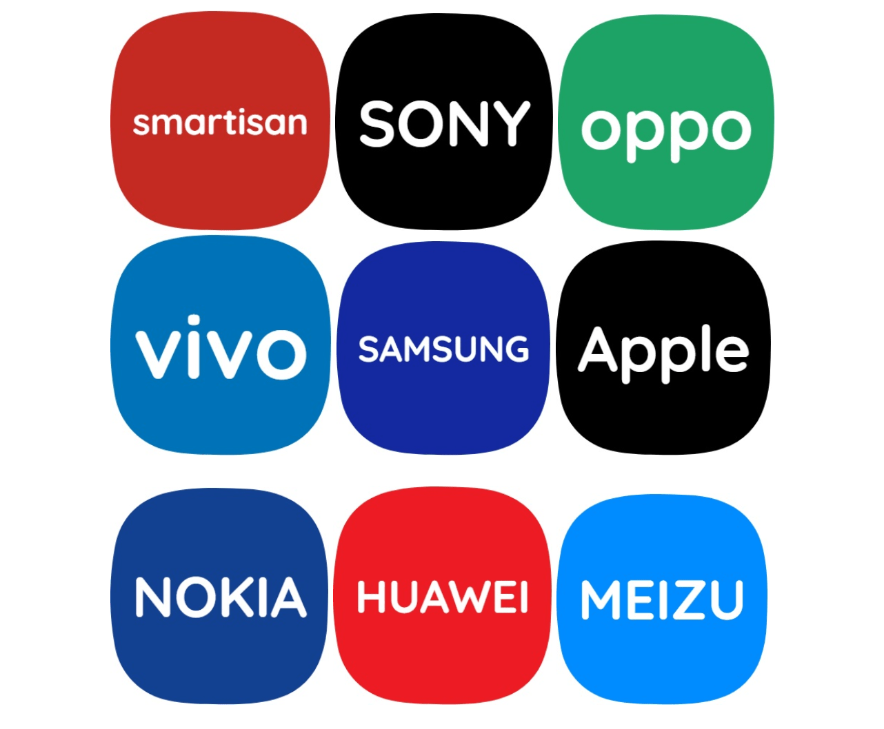
Here is the project worth 2 million! Just click here to make the logo like Xiaomi style!
